Designing for Retina Displays, Optimize Website for @2x Images
Do you know what exactly is Retina? Do you know what makes it amazing or what makes it a nightmare for designers and developers? Well read on to understand the technology and the various ways you can optimize images to be Retina ready.
Understanding Retina
In the simplest of terms, Retina Displays mean a high definition display. But, before going into detail about how to create Retain ready images, you need to understand the technology behind them.
First, let’s go over some terms:
- Device pixel is the smallest physical unit displayed.
- Pixel density is the number of pixels displayed in a given space.
- Resolution is the number of pixels across the entire width or height of a device.
- Pixels per inch, ppi or dpi, is the amount of pixels you get when you divide the physical width of the display by the number of horizontal pixels displayed.
- High DPI is a display density of 200 pixels per inch or greater.
So with that said, you can have an iPad and an older desktop monitor with the same physical size but different pixel densities. The iPad will have many more pixels jammed within the space and because of this the display will be higher quality and of higher definition thanks to it having a higher DPI. So in terms of Retina, this is the same exact concept: same display size but more pixels, which means a high DPI display.
Most images were and still are made in 72DPI for standard displays. However, Retina’s DPI is much greater and those images will look blurry if they are not adapted in their resolutions. This is why you need to optimize your images for high DPI devices.

With Postcards you can create and edit email templates online without any coding skills! Includes more than 100 components to help you create custom emails templates faster than ever before.
Let’s summarize: The smaller the pixels and the closer they are together makes for a much better, shaper and higher quality images. Retina Displays require double the pixels to display the same image as standard definition displays. Therefore, even though iPad 2 and iPad 3 have the same physical screen size, iPad 2 has a resolution of 1024px by 768px, while iPad 3 has a resolution of 2048px by 1536px.
Now that you understand why Retina ready images are necessary it is time to learn the various way on how to optimize your images for such displays.
Raster images

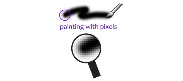
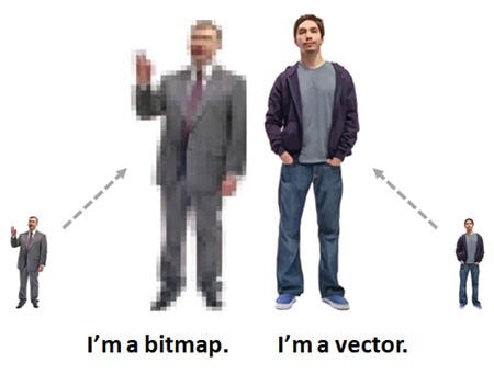
A raster – or bitmap – graphic is based on a dot matrix data structure which means it is based on a rectangular grid of pixels. The most common raster files are JPG, PNG and GIF. Raster images are characterized by being rendered pixel by pixel where each pixel individually corresponds to a particular hue, saturation, brightness, opacity and position within the whole image. The one key thing to note about raster images is that they are resolution dependent, meaning that they cannot scale up without losing the display quality. Ah, but they can scale down which is how you achieve great Retina ready raster images.
In standard resolution, a raster image’s 1 bitmap pixel is equivalent to 1 device pixel. On Retina Displays, a raster image’s 1 bitmap pixel is equivalent to 4 device pixels. In order to accommodate for the change, Retina display multiplies one bitmap pixel by four. Even though the image is displayed in the same size, it is actually being stretched which causes the image to look blurry.
So what can you do about this? First, you will need to have an image that is double in size and you’ll half it for the displayed size – to the original intended size – with code. Here are three common ways of going about this.
HTML and CSS
You can use HTML and CSS to declare an image’s size to be half of what it actually is. So, if you have an image that is supposed to be 300px wide by 400px tall. You need to have this image actually be 600px tall and 800px wide. Through HTML you can specify the image to be half that size.
|
1
|
<img src="myIMG@2x.png" width="300" height="400" /> |
As you can see, this is a very simple and straightforward concept. However, you can also utilize CSS to define the image’s size. So, once again, if you have an image which is 600px by 800px but is supposed to be displayed at 300px by 400px try defining its width and height like this:
With Startup you can build a website online using the Bootstrap builder with ready-made designed and coded templates and themes.
|
1
2
3
4
5
6
|
.image{ background: url (myIMG@2x.png); background-size: 300px 400px; width: 300px; height: 400px;} |
Please note the background-size image property. As the name suggest, it will define the background’s size however, just to be safe do define the width and height for the element as background size is not always supported.
What you can also try in CSS is to define the width and height of images to be 50%. This can be done through a class if you want to target only specific images or if you want to apply it to all images just use the img tag.
|
1
2
3
4
5
6
7
8
|
.image{ height: 50%; width: 50%;}img{ height: 50%; width: 50%;} |
JavaScript
With the help of jQuery, you can pin point images and half their widths and heights. It works the exact same way as the CSS example with 50% width and height declarations.
|
1
2
3
4
5
6
7
|
$(window).load(function() { var images = $('img'); images.each(function() { $(this).width($(this).width() / 2); $(this).height($(this).height() / 2); )};)}; |
Media Queries
Another way to do this is to interchange images based on whether the device being used to view the site is a Retina equipped device or not. The way this works is that you have two sets of images, the regular image and one that is twice its size. You then use media queries to pin point that if this is a Retina Display device, use the bigger image.
|
1
2
3
4
5
6
7
8
9
10
11
12
|
@mediaonly screen and (-webkit-min-device-pixel-ratio: 2),only screen and ( min--moz-device-pixel-ratio: 2),only screen and ( -o-min-device-pixel-ratio: 2/1),only screen and ( min-device-pixel-ratio: 2),only screen and ( min-resolution: 192dpi),only screen and ( min-resolution: 2dppx) {.image{ background: url (myIMG@2x.png);}} |
Scalable Vector Graphics

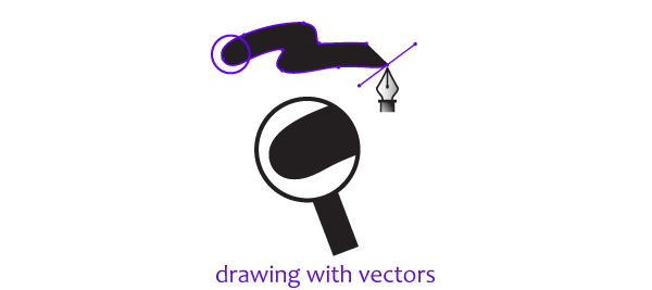
Unlike raster images, SVG, or just vectors, have a great advantage for Retina Displays which is that they can scale up, down and sideways and still look good. The way vectors are constructed is through geometrical primitives such as lines, points, shapes, or curves which are just mathematical expression and this is what gives them the ability to scale without being distorted and looking blurry.
SVGs are dubbed ‘future proof’ because of their infinite scaling abilities. Being a SVG, the image will adapt to any pixel density therefore there is nothing you have to do to it – simply insert the image into the HTML mock up with the size you want it to be and it will adapt and adjust itself to the resolution it needs to be. That is it. And this is precisely the reason you would want to use vector over raster images if you can.

Conclusion
As you can see Retina Displays can be a nightmare to support; however, I do hope you chose to support it as high DPI displays are beautiful to look at and supporting Retina allows for a much better experience for the people who use these devices. I understand that not every image can be a SVG and have the easy way out, such as photos, which is why I went over raster images thoroughly. Additionally, these are not the only ways to go about Retina Displays this is just the two biggest ways of doing so.
